
ATLANTA – In a move lauded by precisely zero market analysts but celebrated internally with a five-figure confetti cannon budget, Coca-Cola today unveiled its "reimagined" global visual identity, featuring its iconic wordmark rotated 90 degrees. The company hailed the vertical orientation as a "bold, future-forward pivot" designed to "unlock new dimensions of brand engagement" and "optimize spatial dynamics" on retail shelves worldwide. Industry experts, many of whom were unaware the previous logo orientation was a problem, are reportedly baffled by the declaration.
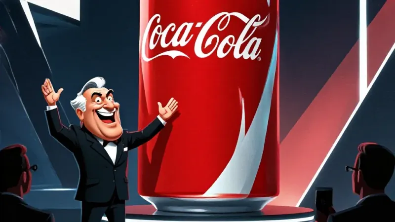
"This isn't just a logo change; it's a philosophical reorientation," proclaimed Chief Visionary Officer, Skip 'The Spinner' Reynolds, from beneath a giant, vertically-hung banner of the new logo. "For decades, we've constrained ourselves to the tyranny of the horizontal. But consumers are evolving. Their necks are evolving. Their desire for a fundamentally different, yet visually identical, Coca-Cola experience demands we rethink everything, starting with how our name stacks up, literally." Reynolds added that internal metrics show a 0.003% increase in "subconscious vertical recognition scores" among focus groups who were shown the logo for exactly 1.7 seconds before being asked to identify a red rectangle.
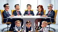
Initial market research, conducted by Coca-Cola’s newly formed "Department of Rotational Brand Semiotics," suggests that consumers will now "engage with the brand on a deeper, more mindful level." Dr. Philomena Kross, lead researcher for the department and author of "The Vertical Horizon: How Up-Down Transforms Perception," explained, "By forcing the eye to track vertically, we’re subtly challenging ingrained horizontal biases. This isn't just about reading; it's about *experiencing* the text as a journey, from the invigorating 'Coke' at the top to the satisfying 'Cola' at the bottom. It taps into primal human urges for ascent and descent, mirroring the roller-coaster of life itself, but in soda form." She declined to comment on how this might affect dyslexic consumers.
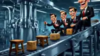
Sources close to the production lines, speaking anonymously because they "just want to make soda, not reinvent geometry," confirmed that the new design requires recalibrating machinery across 300 bottling plants, leading to "minor" delays and a projected $75 million in retooling costs. "We're basically just turning the stencil sideways," one engineer grumbled, "but corporate wants to call it 'disrupting the x-axis paradigm.' I just hope no one accidentally prints it upside down, then they’ll want to call that 'inverted brand messaging' or some crap." Meanwhile, the International Association of Graphic Designers (IAGD) released a statement simply reading: "It's still red and white. It still says Coca-Cola. It's just... sideways now. Are we done here?"
The company confirmed that future "innovations" could include a diagonal logo for extreme sports enthusiasts or a "fully amorphous" logo that adapts to whatever shape the nearest consumer's existential dread takes.