

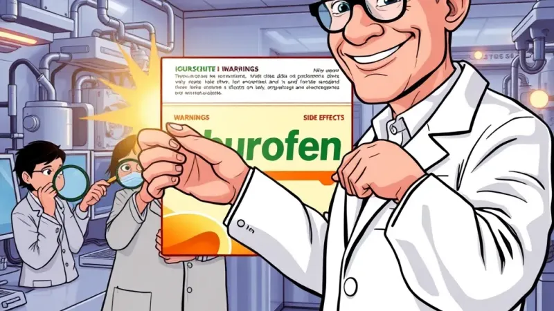
NEW YORK – A landmark collaborative study published Monday by the Institute for Public Enlightenment and Common Sense (IPECS) has confirmed that the paperboard boxes containing commonly used over-the-counter painkillers, such as acetaminophen and ibuprofen, are routinely printed with critical health warnings, dosage instructions, and lists of potential side effects. The revelation, detailed in a 300-page report, has sent ripples of mild astonishment through the global medical community and prompted calls for further investigation into the precise purpose of the tiny, often ignored text.
For decades, consumers have blindly ingested billions of pills, often unaware of the specific dangers associated with each drug. The new IPECS report, titled "The Cartons Speak: Unlocking the Secrets of Pain Relief Packaging," highlights findings previously considered urban myths or whispered anecdotes among a small subset of highly detail-oriented pharmacists. "Our preliminary analysis shows that the tiny, often ignored text on these packages explicitly details crucial differences, such as acetaminophen's liver toxicity risk if overdosed, versus ibuprofen's potential for stomach, heart, and kidney issues with prolonged use," stated Dr. Kendra Finch, lead researcher for the study. "It's like this incredibly vital information was... available all along, just waiting to be noticed by someone with sufficiently powerful reading glasses."
Pharmaceutical companies, long criticized for burying vital health data in dense scientific journals, expressed relief at the study's findings, though some admitted surprise that anyone actually noticed. "We've always believed in empowering consumers with knowledge, which is why we've invested heavily in cutting-edge 'printing technology' directly onto the primary packaging for over 50 years," explained Mr. Sterling Blackwood, Head of Consumer Information Dissemination at PharmaCorp. "While we acknowledge that the average consumer dedicates approximately 0.7 seconds to package review before ripping it open to alleviate a headache, we maintained hope that one day, science would catch up to our foresight. This study validates decades of our commitment to accessible information, even if that accessibility was theoretical." He added that PharmaCorp is exploring innovative new strategies, such as printing key warnings in a slightly larger font or possibly in a color other than microscopic grey.
The study, which involved researchers painstakingly examining over 3,000 unique drug boxes from 17 different countries with high-powered microscopes and a team of dedicated linguists, also found that many labels suggest consulting a doctor or pharmacist, particularly for individuals with pre-existing conditions or those taking other medications. "This 'consult a professional' directive, while seemingly counter-intuitive to the entire premise of 'over-the-counter' accessibility, appears consistently across various brands and dosages," noted Dr. Finch. "It implies a level of personal responsibility we hadn't previously factored into our public health models, which largely assumed a pre-read state of knowledge for convenience products."
The report concluded by recommending that consumers, for the first time in recorded history, consider reading the packaging before consuming medication.